

In June 2020, Stats NZ announced a competition called "There And Back Again", calling on data enthusiasts to visualise the commuter data from the New Zealand 2018 Census. As I find mucking around with GIS data quite satisfying, and my consulting work was quiet during The Great Plague of 2020, I decided to give it a decent attempt.
The Data
The core pieces of data provided by Stats NZ were two tables of commuter data, one for work and one for education. Anonymised regions called Statistical Areas have been defined by Stats NZ, between which the commuter data specifies traffic volumes. My solution also made use of the Statistical Area generalised outlines and centroids geospatial data. Like many New Zealand organisations offering GIS data to the public, Stats NZ released theirs using a platform based on Koordinates. Koordinates offers a variety of download formats, so I chose CSV for the data tables and Shapefiles for the geospatial data, as I have some familiarity with them.
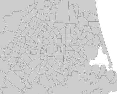
Statistical Areas of Christchurch, New Zealand
I initially went on a bit of a tangent after finding a GIS dataset with a higher area fidelity and a variety of area types, the Meshblock Higher Geographies dataset. The Meshblocks in this dataset were far smaller than the Statistical Areas, and also had a list of "higher geographies" they belonged to, such as Regional Councils, subdivisions, and wards. I thought it might be interesting to show the commuting between these larger areas as well as the Statistical Areas, so I made a simple test that checked if the Meshblocks of a Statistical Area fit into the same area of any given higher geograpy. This did not appear to be the case, so I discarded the idea.
The Approach
One condition of the competition was that the solution will need to be up and running for 6 months. I wanted to make the solution as sturdy, fast, and low-maintenance as possible, so I used an architecture of a web app loading pre-processed static data from an accelerated content delivery network. My final data pipeline consisted of a data processor application which processed the CSV and Shapefile datasets into data files ideal for the web app, storing them on a content delivery network where they could be delivered as quickly as possible to users.
Data Processing
The aim of the data processing application was to structure the data into a format most suitable for the web application, and if possible to make the data more compressible to improve network performance. After some experiments with GeoJSON and Protobufs, I found that Protobufs resulted in a small file size (smaller than the source data) without any perceptible loss of fidelity. Furthermore, the Protobuf data compressed well, with the entire set of output data compressing down to 7.5MB using gzip. Compared to the source CSV and Shapefile data compressing to 20.6MB, this is a decent improvement. While there are better compression algorithms, gzip was used for this evaluation as it can be used for transparent data compression with many web browsers.
The steps executed by the Data Tools are:
- Read the input data (CSVs and Shapefiles).
- Project the geospatial data from the Shapefiles from EPSG:2193 (Northing/Easting Metres) to NZGD2000 (degrees). This makes it easier to place the data in mapping tools like Leaflet later.
- Correlate the data between the different files.
- Arrange the data for optimal use by the Web Application, clustering the geospatial data based on the Statistical Area centroids.
- Save the data to protobuf files: One core data file, and one for each cluster.
In the past I have played around with Shapefiles with applications I've written in C++ using the Shapefile library, so I adopted those tools for the data processing tool. C++ is a controversial programming language these days because of memory safety issues, but I enjoy writing code in it, and if you do things right it usually results in efficient and fast programs. The final data processing tool ran the above steps in about a second, which kept the development feedback loop nice and fast.
Web Application
I wrote the Web Application using React, which I have experience with. Leaflet was used for the mapping aspect, with OpenStreetMap raster tile data used as a map base. The core experience of the application starts with clicking on the map to choose a Statistical Area, leading to an animated display of the commuter relationships between other linked Statistical Areas. The direction of travel can be toggled, which quickly reveals if a Statistical Area is mainly residential or a work/education destination.
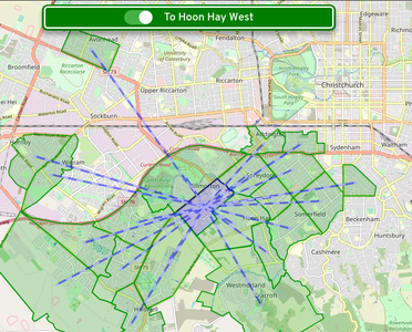
Commuters travelling to Hoon Hay West, a primarily residential area
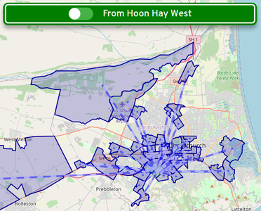
Commuters travelling from Hoon Hay West
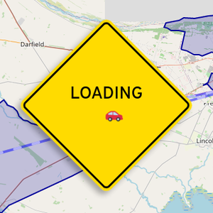
I wanted the interface to be usable but fun, so I styled the interface controls after New Zealand road signs. The typeface used is Overpass by Delve Withrington, which is based on the Highway Gothic typeface. Highway Gothic was developed by and for the United States Federal Highway Administration, and a variant is used by the NZ Transport Agency / Waka Kotahi. When the visualisation is loading data, a "Loading" street sign (complete with an animated car zooming back and forth) fades in to indicate application activity. The signs are formed using HTML and CSS, mainly with border and background styling. The Loading sign uses CSS transformations, one to rotate the encapsulating element by 45°, then another to rotate the inner text and car the other direction by the same amount.
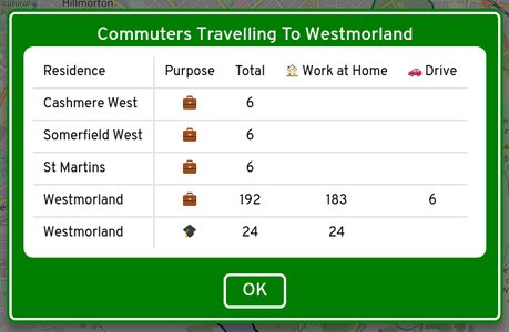
More detailed data can be reached using the tool buttons at the top right of the screen, including a table of commuter statistics for the selected Statistical Area.
The visualisation uses an animated style on the lines to indicate travel direction. Animation was used in other areas to add polish, including the loading car and fades between modals. The fade effect on modals is especially important as it reduces flicker and to some extent hides the Loading sign when data loading is fast.
Amazon CloudFront was used to serve the Web Application. The data files are uploaded with the Content Type specified as appliciation/protobuf, as this ensures that the CloudFront compression system recognises them as compressible. In combination with other technologies such as HTTP/2, the result is a very fast page and data load.
Area Selection
As previously described, users of the visualisation click on the map to choose Statistical Areas. For a good user experience, I wanted the time between clicking and seeing visualised data to be low, and for the picking to be accurate, at least to the house level.
There were some factors in the way of these goals. For one, there are approximately 1,798,000 line segments in the geospatial data, each of which would need to be iterated over as part of a point-in-polygon test. Not an insane number, but it could get a bit dicey on slower mobile devices. Secondly, I didn't want to have to load all of the data before the experience could be used, as a user might only be interested in their local area. To work around these issues, the picking solution in the Web Application takes these steps:
- Iterate over all of the clusters (fifty or so) and run a point-in-rectangle test on each of their bounds. The cluster bounding rectangles are all pre-calculated by the Data Tools. Multiple clusters can be returned from this step, as their bounds often overlap.
- Download the data for the picked clusters.
- Loop over the Statistical Areas in each picked cluster, and run a point-in-rectangle test on each of the Statistical Area bounds (again, pre-calculated). If, after checking all Statistical Areas over all picked clusters, there is only one picked Statistical Area, that Statistical Area is considered selected and its data is loaded.
- If there is more than one picked Statistical Area, loop over each one and test it with a point-in-polygon test. The Statistical Area that passes the test is considered selected and its data is loaded.
Once implemented this method worked well on a variety of devices, so I was happy to include it in the visualisation.